Lab: Network visualization
Last update: 03 March, 2026
![]()
Code
A. About this lab
igraph is an awesome tool for network analysis, but its capabilities for network visualization can be limited and challenging to manipulate. In this lab, we will dive into network visualization using the ggnetwork package in R. ggnetwork combines the power of igraph with the flexibility and aesthetic features of ggplot2, enabling to create more informative, visually appealing network plots.
The exercise is based on the ggnetwork vignette: https://cran.r-project.org/web/packages/ggnetwork/vignettes/ggnetwork.html
B. Packages
1. Visualizing unipartite networks with ggnetwork
In this section, we will plot a simulated, directed food web with increasing plot complexity.
1.1 Simulated food web
# Simulating a food web
foodweb_edges <- data.frame(
  prey     = c("Snake", "Bird", "Frog", "Bird", "Grasshopper", "Zooplankton", "Spider",
               "Grasshopper", "Zooplankton", "InsectLarvae", "Phytoplankton", "Plants", "Grasshopper"),
  predator = c("Hawk", "Hawk", "Snake", "Snake", "Frog", "Frog", "Bird",
               "Bird", "Fish", "Fish", "Zooplankton", "Grasshopper", "Spider"),
  strength = c(0.4, 0.2, 0.5, 0.1, 0.6, 0.2, 0.7,
               0.3, 0.8, 0.4, 0.9, 0.8, 0.5)
)

g <- graph_from_data_frame(foodweb_edges, directed = TRUE)

E(g)$weight <- foodweb_edges$strength
E(g)$strength <- E(g)$weight

# Node attributes
node_info <- data.frame(
  name = c("Hawk", "Snake", "Frog", "Bird", "Fish", "Zooplankton", "Grasshopper", "Spider", "InsectLarvae", "Plants", "Phytoplankton"),
  group = c("Top predator", "Predator", "Predator", "Predator", "Predator", "Consumer", "Consumer", "Consumer", "Consumer", "Basal", "Basal"),
  biomass = c(5, 12, 10, 9, 15, 40, 60, 25, 35, 300, 500),
  trophic = c(4, 3, 3, 3, 3, 2, 2, 2, 2, 1, 1)
)

# Match node attributes with igraph object
node_info <- node_info[match(V(g)$name, node_info$name), ]
V(g)$group <- node_info$group
V(g)$biomass <- node_info$biomass
V(g)$trophic <- node_info$trophic

# Basic plot
p0 <- ggplot(g, aes(x = x, y = y, xend = xend, yend = yend)) +
  geom_edges() +
  geom_nodes() +
  theme_blank()

p0
1.2 Adding attributes
We can add directions, node attributes like biomass, and labels to our plot to provide more information.
# Add directions
p1 <- ggplot(g, aes(x = x, y = y, xend = xend, yend = yend)) +
  geom_edges(arrow = arrow(length = unit(3, "mm"), type = "closed"), color = "grey60") +
  geom_nodes(aes(color = group, size = biomass)) +
  theme_blank()

p1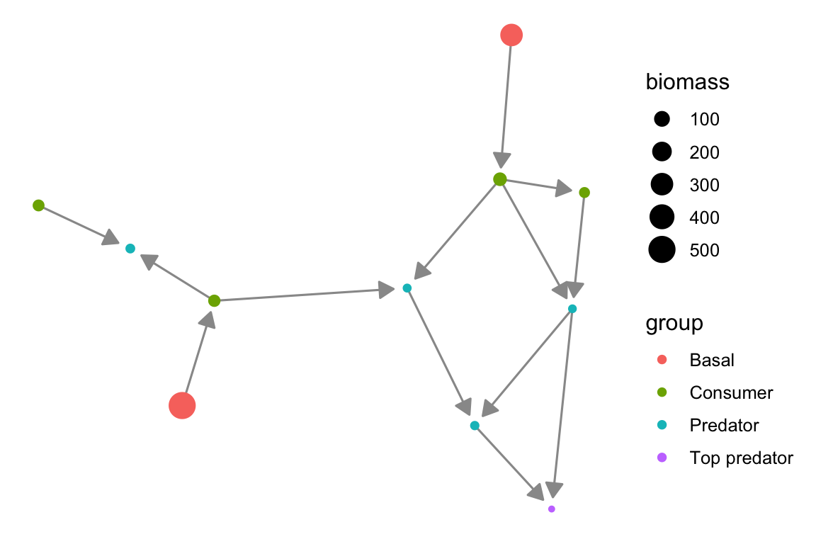
# add node attributes (here - name labels)
p2 <- ggplot(g, aes(x = x, y = y, xend = xend, yend = yend)) +
geom_edges(
arrow = arrow(length = unit(3, "mm"), type = "closed"),
color = "steelblue"
) +
geom_nodes(aes(color = group, size = biomass)) +
geom_nodetext_repel(aes(label = name), size = 3) +
theme_blank()
p2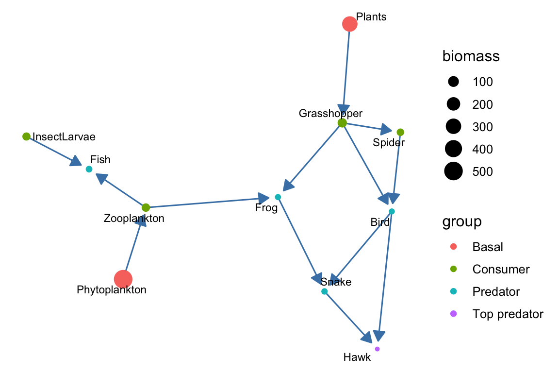 We can also add link weights. Note that here, we use a different method
to display node labels (geom_nodelabel_repel), whereas in the previous
plot, we used geom_nodetext_repel. Choose whichever method works better
for you.
We can also add link weights. Note that here, we use a different method
to display node labels (geom_nodelabel_repel), whereas in the previous
plot, we used geom_nodetext_repel. Choose whichever method works better
for you.
p3 <- ggplot(g, aes(x = x, y = y, xend = xend, yend = yend)) +
geom_edges(
aes(linewidth = strength),
arrow = arrow(length = unit(3, "mm"), type = "closed"),
color = "steelblue" # Fixed color for edges
) +
geom_nodes(aes(color = group, size = biomass)) +
geom_nodelabel_repel(aes(label = name), size = 4,
fontface = "bold", box.padding = unit(1, "lines")) +
theme_blank()
p3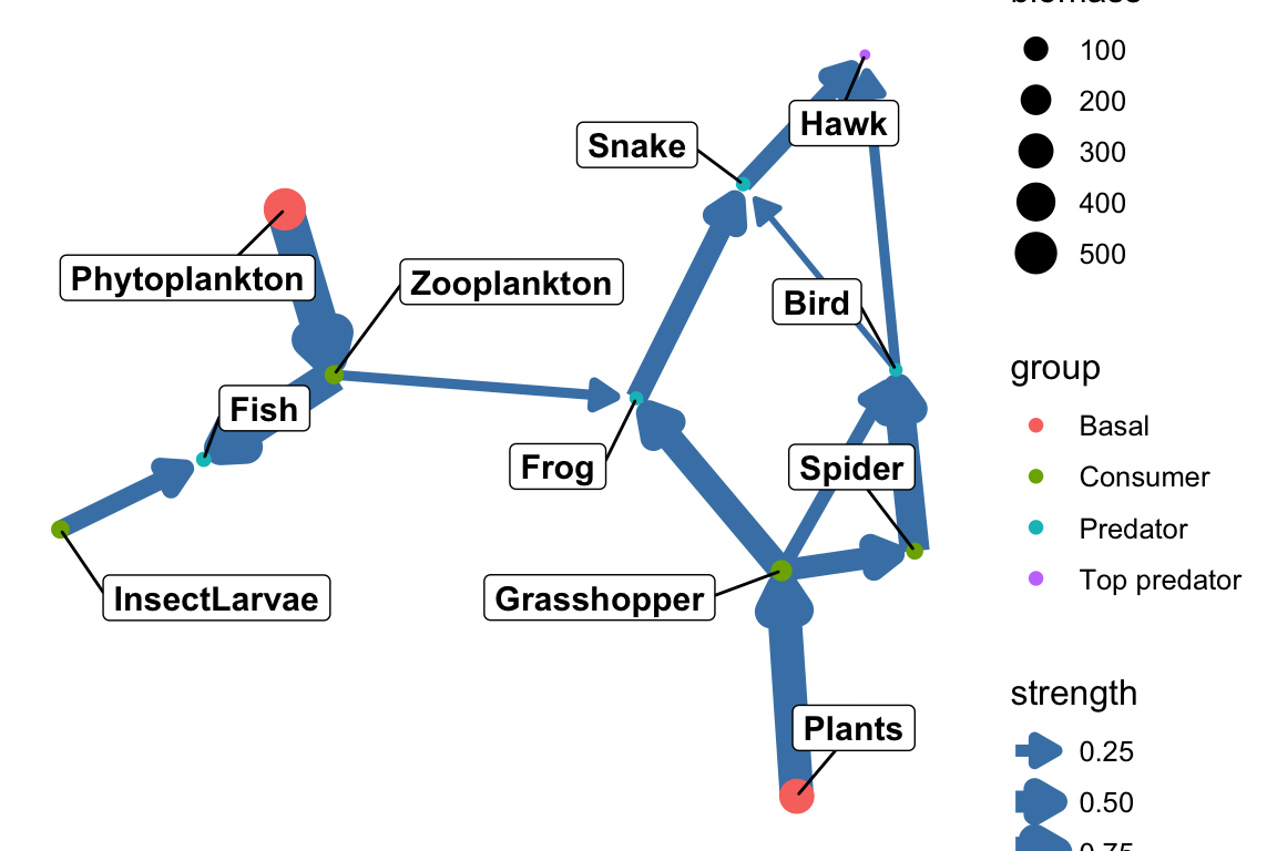 Here and in the other plots, of course, we can endlessly modify the
aethetics…
Here and in the other plots, of course, we can endlessly modify the
aethetics…
1.3 Network layouts
We can adjust the layout of the network plot using igraph (and pass it to ggnetwork) to highlight different aspects of the network. For example, a circular layout removes spatial meaning from the plot, making it easier to focus on the interaction structure (who interacts with whom) rather than on how nodes are distributed across the network.
set.seed(42)
coords_circ <- igraph::layout_in_circle(g)
net_circ <- ggnetwork::ggnetwork(g, layout = coords_circ)
p2_circ <- ggplot(net_circ, aes(x = x, y = y, xend = xend, yend = yend)) +
geom_edges(
arrow = arrow(length = unit(3, "mm"), type = "closed"),
color = "steelblue"
) +
geom_nodes(aes(color = group, size = biomass)) +
geom_nodetext_repel(aes(label = name), size = 3) +
theme_blank()
p2_circ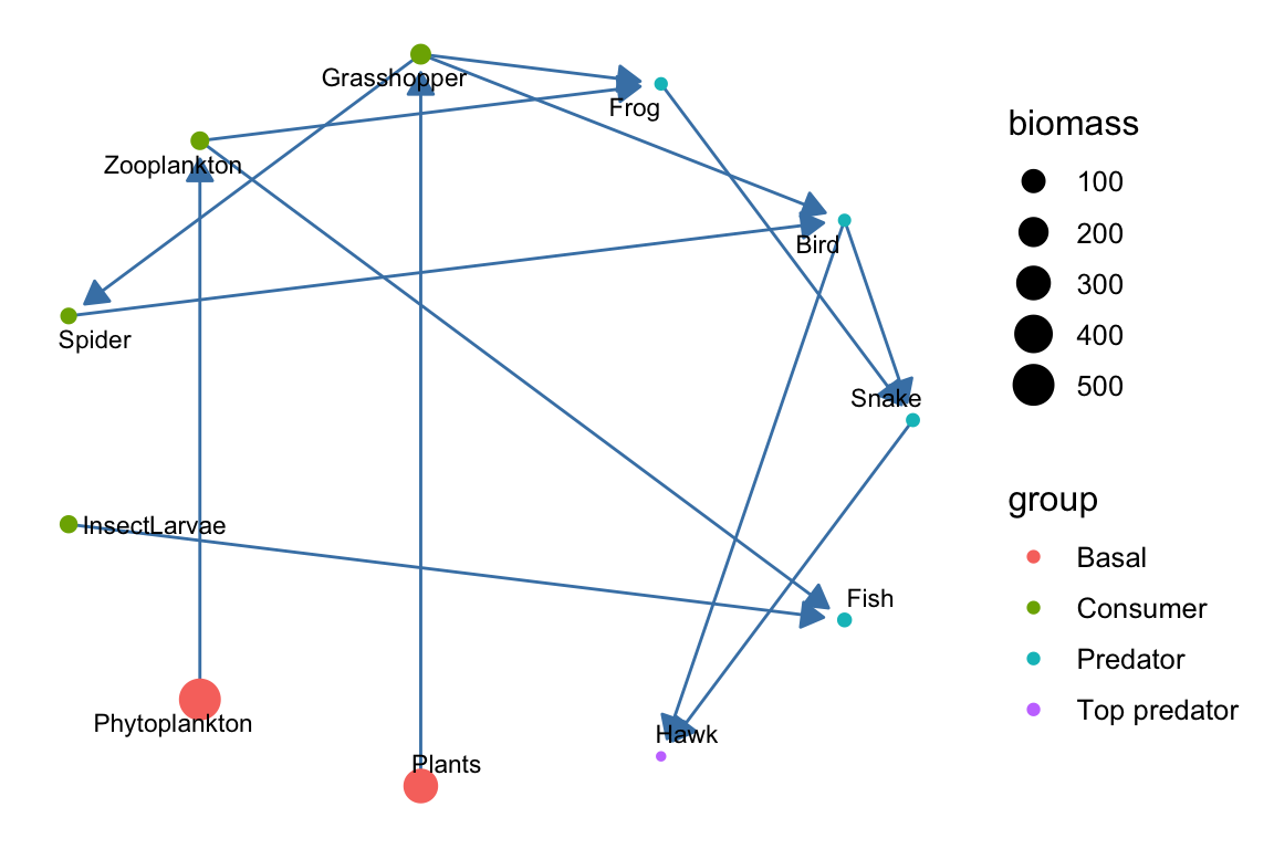 You can see other layout options to consider in the tutorial: https://kateto.net/network-visualization/
Plot the food web by trophic levels: primary producers, herbivores, predators and top predators.
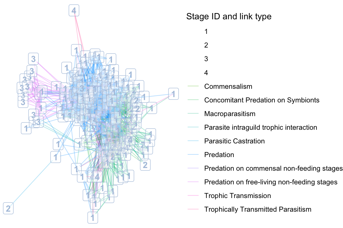
1.4 Empirical food web
We will plot the Otago food web with chosen node and link attributes.
otago_nodes <- read.csv('data/Otago_Data_Nodes.csv')
otago_links <- read.csv('data/Otago_Data_Links.csv')

# Import to igraph, including edge and node attributes
otago_web <- graph.data.frame(otago_links, vertices = otago_nodes, directed = T)

net_df <- ggnetwork(otago_web) # convert to ggnetwork layout

set.seed(42)

# Generate the layout coordinates using igraph's layout function
coords <- igraph::layout_with_fr(otago_web)

# Now pass those coordinates to ggnetwork (via the layout argument)
net_df <- ggnetwork::ggnetwork(otago_web, layout = coords)

names(net_df)
## [1] "x" "y"
## [3] "name" "SpeciesID"
## [5] "StageID" "Stage"
## [7] "Species.StageID" "WorkingName"
## [9] "OrganismalGroup" "NodeType"
## [11] "Resolution" "ResolutionNotes"
## [13] "Feeding" "Lifestyle.stage."
## [15] "Lifestyle.species." "ConsumerStrategy.stage."
## [17] "System" "HabitatAffiliation"
## [19] "Mobility" "Residency"
## [21] "NativeStatus" "BodySize.g."
## [23] "BodySizeEstimation" "BodySizeNotes"
## [25] "BodySizeN" "Biomass.kg.ha."
## [27] "BiomassEstimation" "BiomassNotes"
## [29] "Kingdom" "Phylum"
## [31] "Subphylum" "Superclass"
## [33] "Class" "Subclass"
## [35] "Order" "Suborder"
## [37] "Infraorder" "Superfamily"
## [39] "Family" "Genus"
## [41] "SpecificEpithet" "Subspecies"
## [43] "NodeNotes" "xend"
## [45] "yend" "ConsumerSpeciesID"
## [47] "ResourceSpeciesID" "ConsumerSpecies.StageID"
## [49] "ResourceSpecies.StageID" "LinkTypeID"
## [51] "LinkType" "LinkEvidence"
## [53] "LinkEvidenceNotes" "LinkFrequency"
## [55] "LinkN" "DietFraction"
## [57] "ConsumptionRate" "VectorFrom"
## [59] "PreyFrom"# In the otago web we have data on both links and edges. we can adjust the colors, the linetypes (works less good here because we have a lot of link types) and add labels to show them in the plot.
# Convert StageID to a factor (categorical variable)
net_df$StageID <- as.factor(net_df$StageID)
ggplot(net_df, aes(x = x, y = y, xend = xend, yend = yend)) +
# Plot edges, color them by 'LinkType', adjust alpha and linewidth
geom_edges(aes(color = LinkType), alpha = 0.3, linewidth = 0.4) +
# Plot nodes (this creates the dummy legend for the labels)
geom_nodes(aes(color = StageID), alpha = 0, size = 0) + # Invisible nodes to generate legend
geom_nodelabel(aes(label = StageID), color = "lightsteelblue", alpha = 0.3, fontface = "bold") +
# Set the theme to remove axes and grid lines
theme_void() +
# Adjust legend position to the right
theme(legend.position = "right") +
# Separate legends for 'LinkType' and 'StageID' labels
guides(
color = guide_legend(title = "Stage ID and link type", order = 1), # For StageID (dummy legend for labels)
fill = guide_legend(title = "LinkType", order = 2) # For LinkType (edges)
)
2. Visualizing bipartite networks
In this section, we will visualize bipartite networks using a simulated example and the memmott1999 data set.
2.1 Simulated bipartite network
set.seed(42)
mat <- matrix(sample(0:1, 15, replace = TRUE, prob = c(0.6, 0.4)),
              nrow = 5, ncol = 3)
rownames(mat) <- paste0("C", 1:5) # pollinators
colnames(mat) <- paste0("P", 1:3) # plants

net <- network(mat, bipartite = TRUE, directed = FALSE)

# Define custom layout for bipartite network visualization
custom_layout <- matrix(0, nrow = 8, ncol = 2)
custom_layout[1:5, 1] <- 1:5
custom_layout[1:5, 2] <- 1
custom_layout[6:8, 1] <- seq(1.5, 4.5, length.out = 3)
custom_layout[6:8, 2] <- 2

df <- ggnetwork(net, layout = custom_layout)
df$type <- ifelse(df$y == 1, "pollinators", "plants")

ggplot(df, aes(x = x, y = y, xend = xend, yend = yend)) +
  geom_edges(color = "grey70", size = 0.8, alpha = 0.6) +
  geom_nodes(aes(color = type), size = 10) +
  geom_nodetext(aes(label = vertex.names), color = "white", fontface = "bold") +
  theme_blank() +
  scale_color_manual(values = c("pollinators" = "thistle", "plants" = "lightseagreen")) +
  theme(legend.position = "bottom")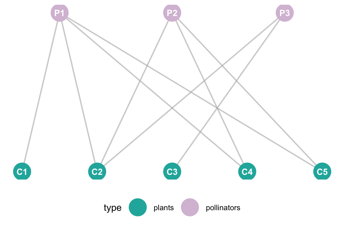
2.2 Empirical bipartite network
# Load Memmott 1999 data and visualize
data(memmott1999)
net_mat <- as.matrix(memmott1999)
net <- network(net_mat, bipartite = TRUE, directed = FALSE)
# Define layout
num_pollinators <- nrow(net_mat)
num_plants <- ncol(net_mat)
custom_layout <- matrix(0, nrow = (num_pollinators + num_plants), ncol = 2)
custom_layout[1:num_pollinators, 1] <- seq(1, 100, length.out = num_pollinators)
custom_layout[1:num_pollinators, 2] <- 2
custom_layout[(num_pollinators + 1):(num_pollinators + num_plants), 1] <- seq(10, 90, length.out = num_plants)
custom_layout[(num_pollinators + 1):(num_pollinators + num_plants), 2] <- 1
# Add metadata
df <- ggnetwork(net, layout = custom_layout)
df$type <- ifelse(df$y == 0, "Pollinator", "Plant")
# Plot
ggplot(df, aes(x = x, y = y, xend = xend, yend = yend)) +
geom_edges(color = "grey80", size = 0.2, alpha = 0.4) +
geom_nodes(aes(color = type), size = 2) +
theme_blank() +
scale_color_manual(values = c("Pollinator" = "#3498DB", "Plant" = "#27AE60")) +
labs(title = "Memmott (1999) Bipartite Network",
subtitle = "Top Row: 79 Pollinators | Bottom Row: 25 Plants",
color = "Species Group") +
theme(legend.position = "bottom")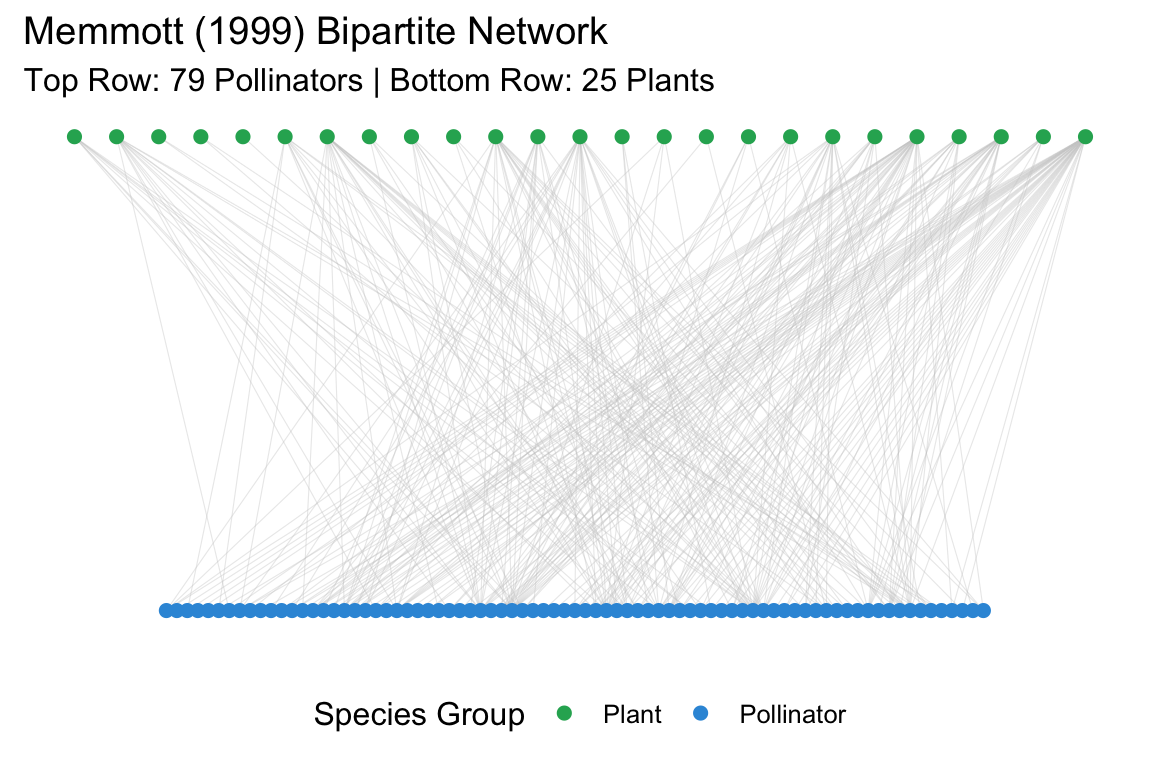 This data set does not have edge weights nor species abundances. For
example purpose, we will produce random weights of integers from 1 to 10
and random species abundances that we will show in the plot.
This data set does not have edge weights nor species abundances. For
example purpose, we will produce random weights of integers from 1 to 10
and random species abundances that we will show in the plot.
# # 2. Add Random Edge Weights (1 to 10) to the matrix
# # We only add weights where an interaction actually exists (non-zero)
# set.seed(42)
weights <- mat_weight <- net_mat
weights[weights > 0] <- sample(1:10, sum(net_mat > 0), replace = TRUE)

# 3. Create the network object
# 'ignore.eval = FALSE' and 'names.eval' are required to keep the edge weights
net <- network(weights, bipartite = TRUE, directed = FALSE,
               matrix.type = "bipartite", ignore.eval = FALSE, names.eval = "weight")

# 4. Generate and Add Random Abundances (Vertex Attributes)
# Total vertices = 79 pollinators + 25 plants = 104
num_nodes <- network.size(net)
abundances <- sample(10:100, num_nodes, replace = TRUE)
set.vertex.attribute(net, "abundance", abundances)

# 5. Define the "Row-in-front-of-Row" Layout
num_poll <- nrow(net_mat)
num_plan <- ncol(net_mat)
custom_layout <- matrix(0, nrow = num_nodes, ncol = 2)

# Pollinators (Top)
custom_layout[1:num_poll, 1] <- seq(1, 100, length.out = num_poll)
custom_layout[1:num_poll, 2] <- 2

# Plants (Bottom - Centered)
custom_layout[(num_poll + 1):num_nodes, 1] <- seq(15, 85, length.out = num_plan)
custom_layout[(num_poll + 1):num_nodes, 2] <- 1

# 6. Convert to ggnetwork
# We must specify 'weights = "weight"' to ensure the attribute is carried over
df <- ggnetwork(net, layout = custom_layout, weights = "weight")

# Add grouping for coloring
df$type <- ifelse(df$y == 0, "Pollinator", "Plant")

# 7. Final Plot
ggplot(df, aes(x = x, y = y, xend = xend, yend = yend)) +
  # Map edge thickness (size) to 'weight'
  geom_edges(aes(size = weight), color = "grey75", alpha = 0.3) +
  # Map node size to 'abundance'
  geom_nodes(aes(color = type, size = abundance)) +
  geom_nodetext(aes(label = vertex.names, angle = 90), size = 1.5, repel = TRUE, max.overlaps = 10) +
  scale_size_continuous(range = c(0.5, 4)) + # Control the spread of circle sizes
  scale_color_manual(values = c("Pollinator" = "#2980B9", "Plant" = "#27AE60")) +
  theme_blank() +
  labs(title = "Memmott (1999) with Simulated Data",
       subtitle = "Node size = Abundance | Edge width = Interaction Strength",
       size = "Scale", color = "Group") +
  theme(legend.position = "right")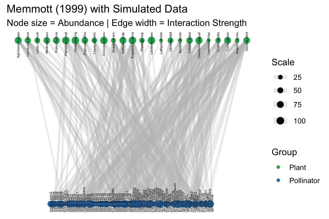
3. Interactive plots
Network plotting goes beyond static networks. With the help of interactive visualization packages, we can create dynamic, engaging plots that allow us to inspect nodes, links, and their attributes in an intuitive way. These tools also offer exciting possibilities, such as visualizing time series of changing networks and much more.
Two main packages for interactive network visualization in R are visNetwork and networkD3. These packages allow us to create JavaScript-powered visualizations directly from R. You can explore more about this in the tutorial here: https://kateto.net/network-visualization/ and in this basic interactive graph guide with networkD3: https://r-graph-gallery.com/network-interactive.html
In this exercise, we’ll have a basic example using the simulated food web we created earlier. We’ll turn it into a simple interactive plot using networkD3, which is incredibly useful for inspecting nodes.